The Problem
To improve organizations' AppSec posture by guiding AppSec teams to the most valuable and concise tasks, while at the same time offering practical solutions for the problem.
The Solution
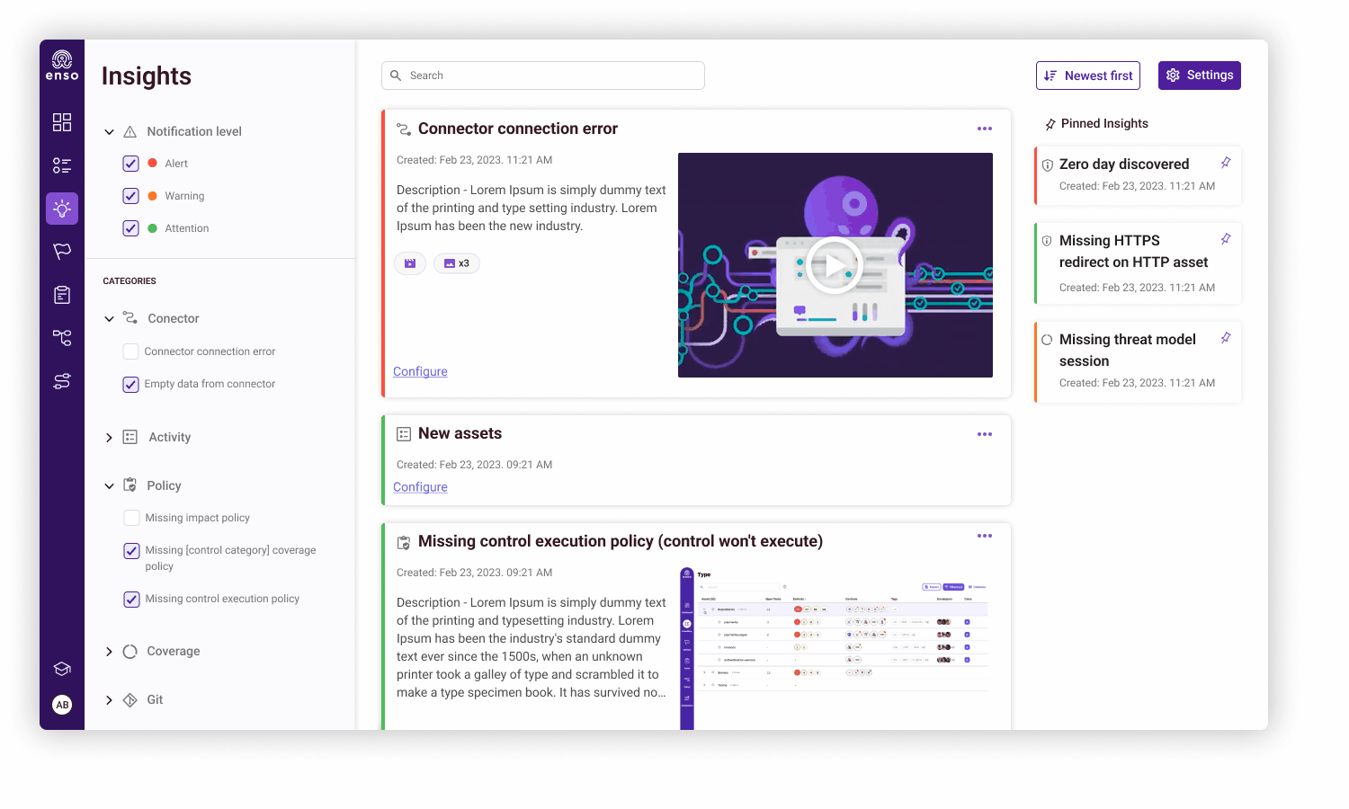
To create a new page, where the Insights will be providing pertinent information and offering the ability to efficiently manage these diverse insights for swift problem resolution.
Insights
Enso is the first Application Security Posture Management (ASPM) solution that helps security teams everywhere eliminate their AppSec chaos with application discovery, classification, and management.
Insights are information messages generated automatically by the system.
Insights can be based on information contained internally in the system (e.g. assets, controls, policies,
connectors, etc.) or external sources (e.g. news and new discoveries).
The Enso Platform

My Role
The Team
Tools
Years
-
Research
-
Sketches
-
UX
-
UI
-
Product Team
-
R&D Team
-
Figma
2023
The primary goal for this page is to develop an interface that seamlessly delivers a wealth of information while ensuring accessibility and effortless comprehension.
The intention is to transform it into an indispensable daily tool for the AppSec team and allow them to efficiently navigate through crucial details as needed in the morning. To establish if there is an issue that demands attention and if so, to find out how critical it is.
Inspiration was taken from the layered format of news pages. Much like the concise titles and details in news articles, our design facilitates a rapid understanding of the core information.
Users, such as the AppSec team, can gauge the essence of each aspect at a glance. If a deeper dive is necessary, a simple click allows them to zoom in and extract the relevant details, ensuring a comprehensive grasp of the current situation.
An Inspiration for Layers
.png)
The emphasis lies in attending to minute details.
In addition, we've contemplated 'save' or 'pin' insights, enabling users to earmark and preserve crucial insights for easy retrieval.
The first mockups
Based on customer feedback, several adjustments were necessary:
-
We acknowledged the need for a more comprehensive focus on categories, a crucial aspect for our customers. They expressed a desire for a swift option to view, modify, and exercise control over displayed content.
-
For smaller displays, the lack of a dedicated action item meant users had to rely on the title alone to understand the continuation of insights and the steps to resolve a problem
-
It was not possible to share insights. The AppSec team highlighted the importance of enabling the seamless flow of insights among team members rather than keeping them segregated.
.png)

The first challenge
The main challenge was around the structure of the Side Menu, originally designed based on inspirations from the new branding at the time.
As time passed and the platform experienced extensive use, it became evident that the existing structure was no longer aligned with our needs.
The primary issue centered on space inefficiency.
The circular menu, while aesthetically pleasing, consumed valuable space on each side that could have been utilized more effectively.
Additionally, integrating a category page seamlessly into the current design proved problematic.
Considering these considerations and the need to incorporate additional categories, which was difficult within the existing menu framework because of space constraints, we made the decision to redesign the Side Menu.


While adhering to the same core principles, the redesigned Side Menu sported a slightly different aesthetic.
Upon its implementation, customer feedback highlighted an unexpected outcome. Despite our initial aim to infuse a sense of coolness and playfulness into an 'adult' field, the new design inadvertently projected a more serious, efficient work tool. The shift in perception, as voiced by our users, underscored the need for a balance between style and practicality in our system
The new mockup

In response to customer feedback and a deeper comprehension of the feature, we have decided to broaden the range of actions that can be performed on insights.
The expanded list now includes the following options:
- Hide
- Pin
- Postpone
- Copy URL
- Dismiss
The second challenge


The updated display significantly enhanced clarity and convenience for our users.
However, another challenge emerged when we unintentionally introduced confusion with two hidden options namely: Dismiss and Hide.
Understanding the distinctions and how users could retrieve or reintegrate insights into the feed became a crucial aspect.
Dismiss - Archiving an insight now promptly removes it from the main feed.
Hide - Disabling an insight type via specific insight actions immediately conceals all other insights from that category.
I created a new category called 'Hidden,' according to the existing pattern. This category features two distinct options accompanied by informative tooltips.
Furthermore, we have refined and clarified the names associated with these options for enhanced user understanding.
Archive (Formerly Dismiss) - Accessible solely through settings.
Don't Show Insight (Formerly Hide) - Easily accessible through categories for swift management.
These adjustments aim to eliminate confusion and provide users with a clearer understanding of the options, making their navigation more intuitive and efficient.


To maintain consistency and streamline development efforts, I used existing components and patterns. As an example the Insight Info opens in the right drawer navigation pattern, aligning with its use for another entity in the platform.