The Tracking System
GetPackage offers comprehensive delivery solutions to SMBs. The SaaS platform provides all the tools needed to manage and track deliveries with ease.
The Platform

My Role
Tools
Years
-
Research
-
Sketches
-
UX
-
UI
-
Figma
-
Illustrator
2021-2022
The Problem
1. The current system lacks a unified report for the delivery date
2. Real-time tracking of all deliveries is not possible
The Solution
1. Characterization and design of a new screen that centralizes delivery data, allowing for enhanced tracking and analysis.
2. Enhancement of the tracking page to provide more comprehensive information and real-time updates.
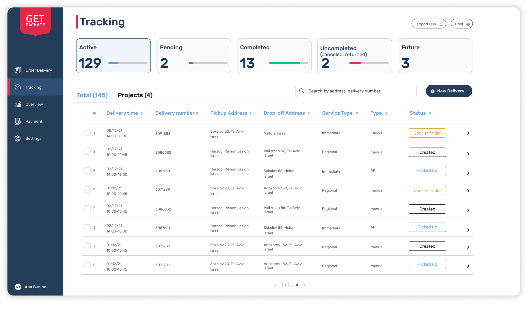
Tracking Page
Users Pain Points
The company offers two shipping options: sending a single order or consolidating multiple orders.
However, the platform treated these as different shipment types, each with its tracking location.
From the customer's perspective, both are considered deliveries. Whether a single order or multiple orders shipped together, it was challenging to track the shipments in real-time.
Customers faced difficulties in staying informed about the progress of their deliveries, leading to confusion and increased support calls.
The Solution
To address this, we aimed to streamline the tracking experience, ensuring customers have clear visibility into their orders and reducing the need for support inquiries.
The solution was divided into 2 parts:
-
Display a quick overview of the delivery status.
-
Centralize all orders in one accessible location.

The Delivery status
The tabs are interactive, with 'active' set as the default.
-
Active - orders are currently en route, having been collected by a courier for delivery at the designated time.
-
Pending - indicates an order awaiting a courier, allowing changes like delivery cancellation, address modifications, or contact person updates.
-
Completed - the order was successfully delivered to the customer.
-
Uncompleted - indicates deliveries that concluded without reaching the customer. This could result from various scenarios such as the customer's absence, unpreparedness, or other unforeseen circumstances.
-
Future - shows upcoming deliveries, starting on the same day but later or on a different date entirely.
Centralize all orders
The display of single and multiple orders was originally scattered across different screens within the platform.
Individual order information is readily available, but details about multiple orders aren't - including only shipping time, amount, and routes.


After engaging in discussions with customers, the optimal solution emerged: consolidating both types of orders onto the same screen.
To maintain a user-friendly format, I retained the information layout for individual shipments, known for its readability.
The resulting screen featured two tabs:
Tab 1 - Total - showcased all individual orders.
Tab 2 - Projects - centralized multiple orders.
He presents an overview of their routes.
Users could drill down within each point to access detailed information about individual orders.
To enhance clarity, I integrated the details that originally appeared in the pop-up for multiple orders into the order line.
This unified approach provided users with a clear and swift understanding of the status and details of each order.
Overview Page
Users Pain Points
The previous method of tracking deliveries was through an Excel file with a monthly report, which was only accessible on the payments page. This method was inadequate as it provided little clarity on the delivery operations and failed to offer any meaningful insights.
The Solution
The product team and I realized that the monthly report in the form of an Excel file was lacking in providing a clear and meaningful overview of the deliveries.
To address this, we decided to enhance the report by incorporating data visualization techniques.
I designed a new page in the system that utilizes these techniques, drawing inspiration and guidance from various resources that specialize in effectively emphasizing key data points
Through customer feedback, the product team and I identified the key data points that are most valuable to our customers. We understood that they desire to have visibility into:
- The total cost and volume of deliveries
- The most frequently utilized delivery services
- The status of each individual shipment, including details on deliveries and returns
The Final Design
A monthly overview page offers a comprehensive understanding of the business's delivery performance. This page, which I developed, provides information on monthly delivery volumes, costs, and areas of success or failure, allowing for better tracking and analysis.
In addition to these things, I added a graph that shows the daily distribution of deliveries.
From it, users can learn what the strong days were, or what the troubled days were (with many refunds).
This way, users can learn that maybe on Sundays there are more cancellations/returns because maybe it's the beginning of a week and there are more traffic jams on the roads and couriers than others to customers.
Also on the page, users can filter according to the type of service. As the product team and I understand, it is very important for customers to understand what was the most successful, most profitable type of service.

